Let's Play That Overnight Game Sensation "Pick Your Pie Chart"
My new friend CATO and I have covered a lot of ground today. From Kierkegaard to Aristotle, from Islamic justice to the federal budget. Whoooo I'm getting light headed from all this discussion.
Somehow we ended up with the National Debt and Budget Deficits. My friend CATO says " Most of the debt piling up is actually because of his social programs which rival The New Deal." I was always taught the "New Deal" was a good thing. But then again, I went to the government school's propaganda mill not the good ol'
1950s Catholic School where the nuns beat the crap out of you.
Regardless, my curiousity was aroused so I thought I try to find a chart to disprove Cato's assertion. What I discovered is that a whole lot of people out there are making pie charts and they're all different. The one thing you can be sure of is that when someone puts a chart out on the internet that they make sure to get one that reflects their bias.
Here's one example: ( Yes, I know it's a Bar Chart ) Now you know these guys are big supporters of the military. Why else would they make up a chart to show how much more the military gets than things like schools?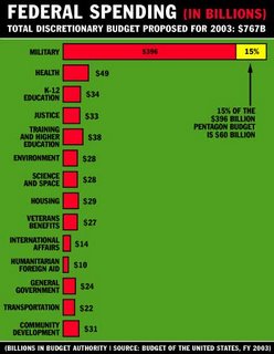
And here's another fun one: I haven't asked CATO, but I think he'd like this one.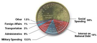
I really like it because it's a cool design. Because it looks so cool, I don't realy mind that it lumps Social Security and Medicare into that evil "Social Spending" category.
The fact that Social Security and Medacare spending comes from seperate Trust Funds outside the Federal Budget really doesn't matter when you can make a chart look this cool.
Here's my all time favorite: What's great about this one is they don't go along with the myth that 100% represents the whole pie. For these guys 7.65% is close enough for them to just round up to 100%.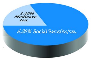
I don't think I learned anything about how the government spends money from these charts. But I'll tell you what I did learn. If you want to find a chart that proves the other guy is wrong, be sure you go to a website that has the same bias as you have. It's really the best way to play "Pick Your Pie Chart".












1 comment:
Cato:
My picture of your vision is growing:
1. In school all the students get straight A's because they are private schools with no tax payer dollars invested. A hyper-Lake Webegonian school world.
2. There's no government debts and there are no government surpluses.
3. You can carry my AK-47 into the Kwik Trip, etc.
4. One question that is not clear -- I'm not sure you are a golfer -- but, in your world, would all golfers play 18 holes with only 18 strokes, i.e., every tee-off would be a hole-in-one? Or would this only hold true for the public-funded courses?
Post a Comment